4 branches.
1 line.
1 line.
The day, told plainly. Rotiera runs booking for businesses with many branches and many people, and it speaks like a calm colleague who knows exactly where everyone is.
Every business that books people lives on a single line: opening to closing. Rotiera draws that line and puts everything on it in its moment. People, bookings, money, the next thing to do. The rose dot is always now.
We say what is happening, in full sentences, with exact numbers. No jargon, no hype.
Few things at a time, each one big. Space around everything. The day never shouts.
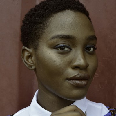
Real faces, warm paper, the colours of a day. It feels like a good front desk, not a database.
The wordmark is set in Satoshi Black, tight, lowercase. The dot of the i is the rose "now". The mark is the brand's idea in one picture: a line, and the moment on it.
Never set the whole word in rose. Rose is only for now.
Never capitals, never spaced out.
Never a gradient on the logo. The day colours live in the product, not on the name.
Warm paper and deep ink do almost all the work. Rose means one thing only: now. The five day colours, from dawn to dusk, give every branch and every person their own colour, so a busy day reads at a glance.
Each day colour also has a soft tint (12% on paper) for backgrounds of bookings and cards. Status colours stay separate: green for done and paid, amber for waiting, red only for problems.
Satoshi by Indian Type Foundry, free for commercial use. Geometric, confident, warm at large sizes. Big statements are Black and tight; everything you read is Medium. Numbers always line up.
The line is Rotiera's signature. It runs opening to closing. Moments hang from it on a thin stem: a person, a booking, a payment. Time ranges sit on it as soft bars in the day colours. The rose dot is now. Use it in the product, on the website, in emails, on a shop window.
A photo or a label on a 26 px stem, always hanging down to the line at its exact time.
A booking is a 12 px rounded bar on the line, in its person's day colour. Done ones fade to paper.
One rose dot with a soft pulse. There is never more than one now on screen.
Rotiera talks like an experienced manager: short sentences, real names, exact times and amounts, and the next step. Confident, never cute. Every booking, client and payment has a clear reference, so people can find anything in one search.
Ivy is 10 minutes late. Dr Okafor is free until 12:40.
Oops! Looks like someone's running a little behind 😅
Booked. Mia Ross, whitening, Wednesday 13:15. apt_8F2KQ7
Awesome! Your booking has been successfully created!
This card was declined. Ask Will for another card, or send him a payment link.
Error 402: payment_failed
The line draws itself from left to right. New moments drop onto it and settle softly into place. Durations stretch out like a breath. Nothing spins, nothing flashes. Press the buttons.
Timing: 600–900 ms, ease-out (0.2, 0.85, 0.25, 1). The now dot pulses every 2.4 s. Respect "reduce motion": everything appears in place.
People are the business. Show real people in natural light, looking like themselves, cropped in a circle when they sit on the line. Never AI-made faces, never staged stock grins, never a face without a name next to it.
Sample photos from Unsplash for the prototype. In the product, staff upload their own; clients without a photo show their initials on their day colour.
How the identity carries from the website to a client's phone and inbox.
The mark and app icon as SVG. The font comes with its free licence. Full wordmark outlines and the brand kit follow once you approve this direction.
Rotiera brand identity v1. Prepared 15 October 2026.